
Skip to content
Concept redesignSignature packageWeb designCopywritingLocal SEOOnline booking

The Reedy House

Boutique hotel & restaurant · Greenville, SC

A 22-room inn on Main Street with a wood-fired restaurant downstairs, still selling itself with a 2012 slideshow template and a PDF menu. Redesigned so the rooms, the fire and the booking all come first.

The problem

A great business, hiding behind its website.

  1. 01

    The menu was a 4 MB PDF download, which is the worst thing to open on a phone outside a restaurant.

  2. 02

    The rooms, the restaurant and the town were all buried in one long “Welcome to...” paragraph.

  3. 03

    Booking went through a clunky third-party bar, and table reservations weren’t online at all.

  4. 04

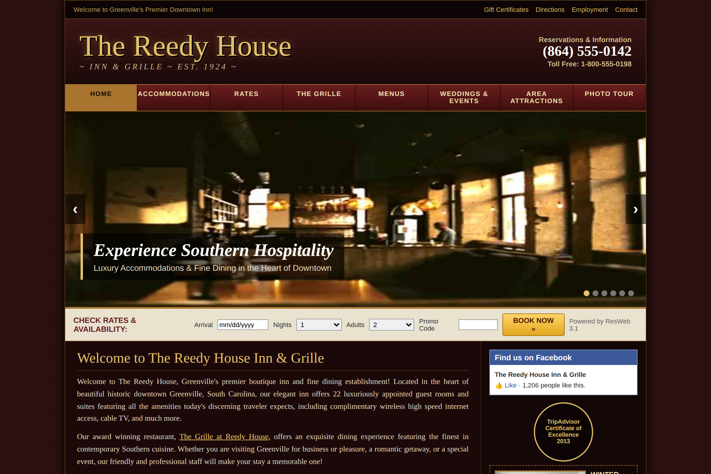
    A dark slideshow and a 2013 TripAdvisor badge made a well-run hotel look like it had stopped trying.

What changed

New design. New words. Same great business.

Old headline

Experience Southern Hospitality

New headline

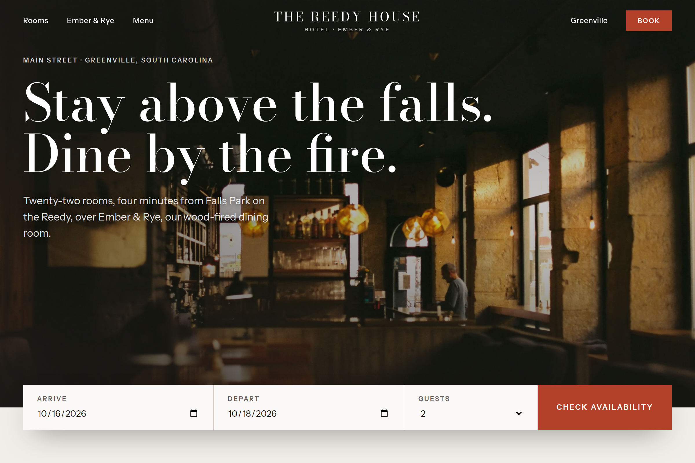
Stay above the falls. Dine by the fire.

Design

  • Ember red, soot and pale ash, warm like the fire downstairs without the dark, dated look.
  • The bar in late light up front, low and warm like the fire downstairs, with the headline over the dark and a booking bar under it like the big hotel sites.
  • Rooms shown with photos and starting prices, so guests can choose before they call.
  • The menu set like a printed card on a red tablecloth, with Dinner, Brunch and Bar tabs.
  • One form to request a room or hold a table, with no card needed.

Copy

  • “Stay above the falls. Dine by the fire.” Two reasons to come, in seven words.
  • Short, specific lines in place of “luxuriously appointed” and “discerning traveler.”
  • Walking times from the front door, so guests know the car can stay parked.

On a phone

Made for the phone in your customer’s hand.

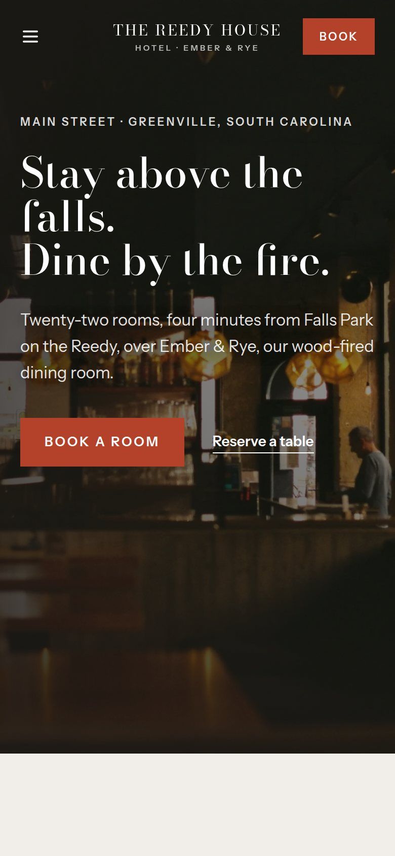
  • The homepage on a phone, the bar in late light under the headline "Stay above the falls. Dine by the fire.", with a red "Book a room" button and a "Reserve a table" link.
    Book a room or a table from the first screen
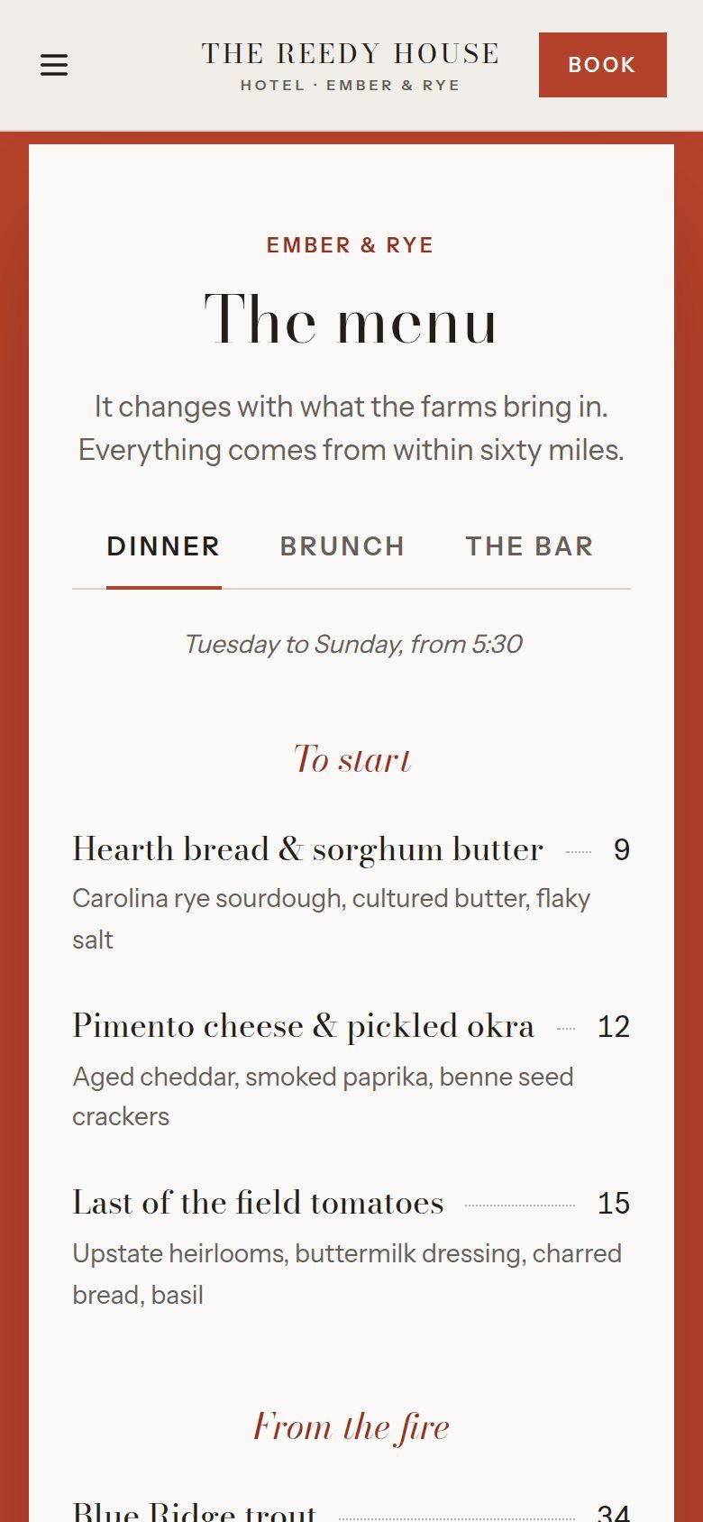
  • The menu on a phone, set like a printed menu card on an ember-red background, with Dinner, Brunch and Bar tabs and dishes with prices.
    The menu, readable on a phone (no PDF)
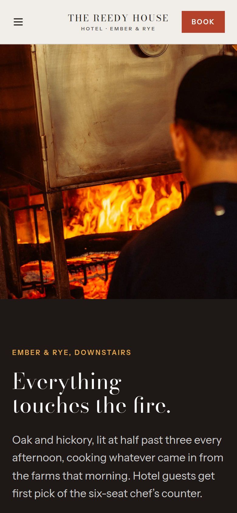
  • The Ember & Rye section on a phone, a cook at the wood fire above the headline "Everything touches the fire."
    The restaurant gets its own spotlight

Built to deliver

What this redesign is built to do.

the menu reads right on the page
0 PDFsthe menu reads right on the page
for a room or a table
1 formfor a room or a table
to Falls Park, said up front
4 minto Falls Park, said up front

Concept redesign: a fictional business used to demonstrate my process. These are design outcomes, not measured client results.

The situation

The Reedy House is a 22-room inn in a 1920s storefront on Main Street, with a wood-fired restaurant downstairs. Guests love it once they arrive. The website hadn’t changed since about 2012: a dark slideshow, a script logo, a booking bar from a third-party tool, and a dinner menu you had to download as a PDF.

The approach

People choosing a boutique hotel want to see the room, see the price, and book it. People choosing dinner want to read the menu and grab a table. The new site does both from the same page: the bar up front, rooms with prices, the restaurant in its own section, a menu you can read on a phone, and one form for a room or a table.

The copy drops the brochure language for short, specific lines: twenty-two rooms, four minutes to Falls Park, oak lit at half past three.

What it’s built to do

This is a concept redesign, so I’m not inventing numbers. It’s built to turn more visits into direct bookings (no booking-site commission), fill tables on weeknights, and make a small, well-run hotel look as good online as it feels in person.

Your business could be next.

Tell me a little about your business. In a few days, you’ll get a free mockup of your new homepage — words included. No cost, no pressure.

Get a free mockup